| Long-S | 
|
Long-S (Italics) |  |
Long-S
During the 1700s, most typesetting made use of a character now referred to as the "Long-S". The Long-S was
used in the place of the lowercase 's', except when the 's' appeared at the end of the word. The Long-S character
appears similar to an 'f', except the cross bar only proceeds halfway through the letter. To keep things interesting,
the Long-S also has a different appearance if it is in italics. In italics, it appears similar to an integral symbol.
The following are the two forms of the Long-S:
| Long-S |
|
Long-S (Italics) | |
The following table shows a few words in modern typesetting, Long-S roman, and Long-S italics to give you an idea of what the impact is.

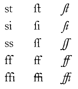
Ligatures
Typesetting of the time also included what is referred to as ligatures. These are changes to the appearance
of the font when two (or three) characters are side by side.
The most commonly noticed ligature is when 'c' appears before 't'. It looks like this:

Many of the ligatures are the result of a place where the two letters would have overlapped, causing unsightly typesetting. One example of this is where the dot in an 'i' would overlap a preceding 'f'.
The following table shows some common ligatures, showing the modern typesetting, roman, and then italic versions. Remember, the 's' is now a long-S in these examples.
What Does All This Mean?
Given all of this, what does this mean about the readability of the older books? Have no fear, amazingly, after
a couple pages, your mind will automatically recognize the long-S as an 's' and you won't notice it anymore. We
were surprise how quickly we adapted to it when we first started reading this kind of typesetting.